Animation: Annual Surface Temperature Anomalies
This project shows annual global surface temperature deviations from mean temperatures in 1951-1980. The data comes from NASA Goddard Institute for Space Studies Surface Temperature Analysis v4. Inspired by ECMWF’s plotting style in its Copernicus Climate Change Service Atlas (C3S Atlas), the plots were created with XArray, Cartopy, and Matplotlib. A basic outline of the coastlines was added to make the continents more recognisable.
Global Scale
The Robinson projection was used to plot the data across the mostly inhabited parts of the globe. Since distortion along the poles is severe in this projection, separate plots of the poles were made (see sections below). The goal in this plot was to visualise the warming globe from the 1980s. See how hotter temperature anomalies have become more common and more intense from the 2000s.
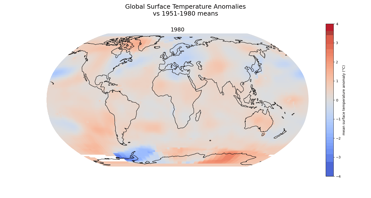
Note
There is a slight annoyance with the shifting gradients on the colourbar, even though the upper and lower limits stay the same. I’ve tried just setting the colourbar values to the levels in 2025 (instead of re-plotting it for every year’s data), but I haven’t gotten it to work.
The Arctic
This plot was initially plotted with an Orthographic projection centering on 90°N and 0° longitude. However, this resulted to the Arctic region being a bit too small for the surface temperature data to be of visual significance. The North Polar Stereographic projection was instead used, with some zooming and reshaping to work around the shape of the globe when viewed from above the Arctic. The resulting image is a pseudo-orthographic view of the Arctic region from a latitude just below Iceland.
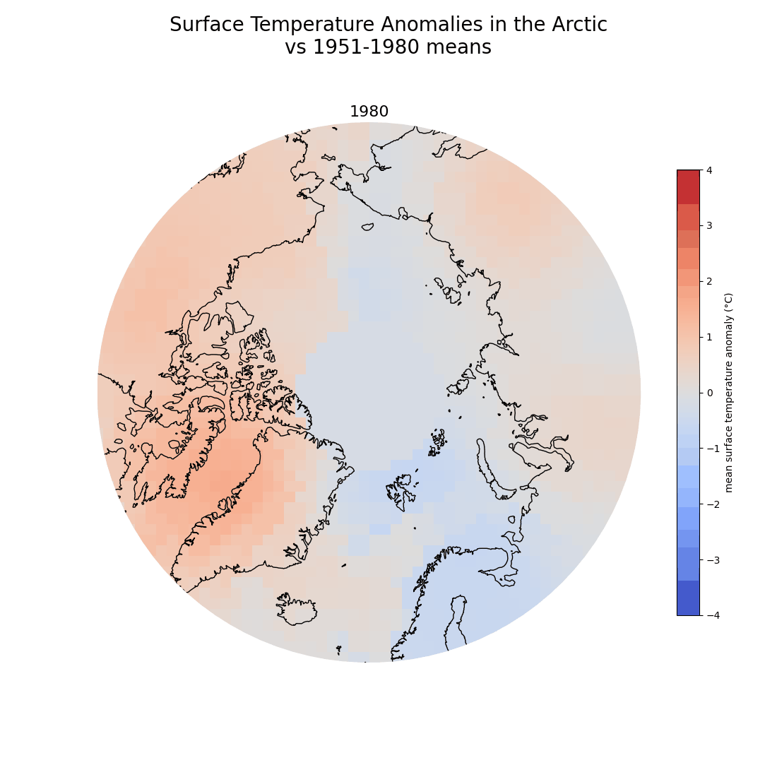
Note
Annoyingly the tile around the north pole is just one big awkward circle. How have others worked around the map tiles over the poles?
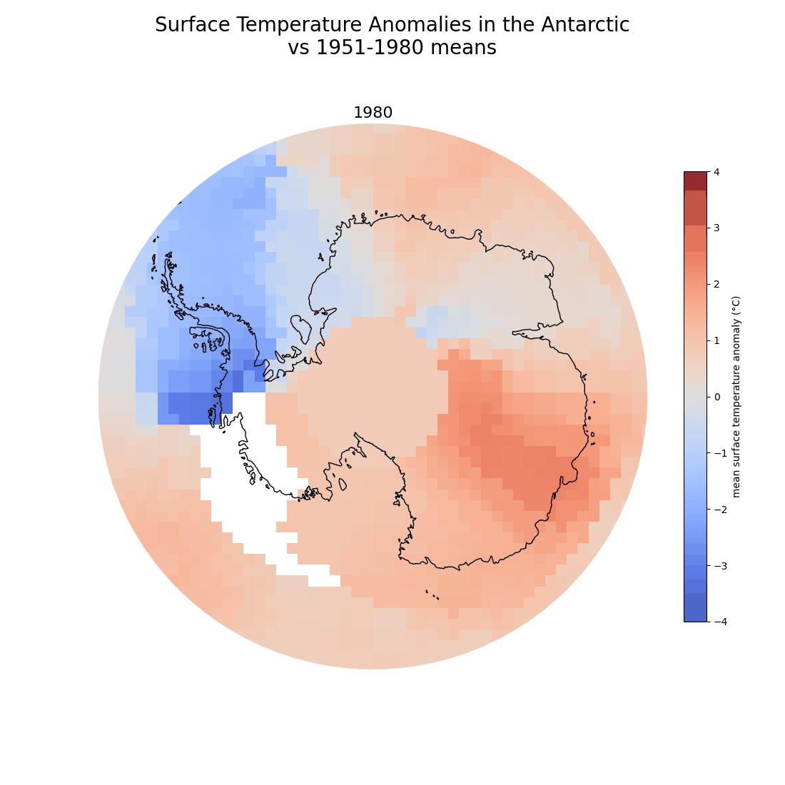
The Antarctic
The South Polar Stereographic projection was used to plot the data over the Antarctic, using the same transformation done as the one in the Arctic plot above. This zooms into the Antarctic continent so that the surface temperature anomaly data can be more easily seen over the region.
Data Sources
NASA Goddard Institute for Space Studies (GISS) Surface Temperature Analysis (v4)
Land-Ocean Temperature Index (LOTI) deviations from the 1951-1980 means
NaturalEarth dataset
NaturalEarth data: “Admin 0 - Countries” 1:50m Cultural Vector: De facto boundaries of countries in the world.
Tools Used
Python libraries:
- Cartopy
- Xarray
- netCDF4
- Matplotlib
Request access to source code
Github: https://github.com/shielamms/MAPS-climate-anomalies.git